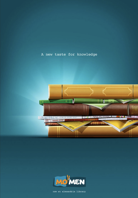

The design featured above is an advertisement for a restaurant chain, called Mo’men, opening a new branch inside a popular library. I found the original design here. The designer, Ahmed El-Habashy, works for the agency DDB Cairo. This design perfectly merges the two worlds of gastronomy and literature by using the characteristical features of hamburgers and applying them to paper magazines.
Contrast analysis
The contrast between the blue background and the bright colors of the hamburger helps us to see the hamburger immediately. It draws our eye to its odd shapes and allows us to slowly discover that it is made out of magazines rather than regular ingredients. Additionally, the designer utilized a design of lights that come from behind the hamburger. This, once again, draws our attention to the center of the design.
Repetition analysis
The designer used the same font for all writing that is not the logo of the restaurant chain.
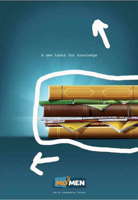
Alignment analysis
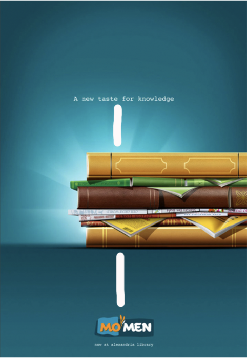
The designer used alignment well by aligning the catchphrase “a new taste for knowledge” with the restaurant’s logo, and the last sentence indicating the purpose for the ad, “now at alexandria library.” The pillar of light coming from behind the hamburger is centered on the page and aligned with the rest of the text, which further emphasizes that the hamburger is the main piece of the design.
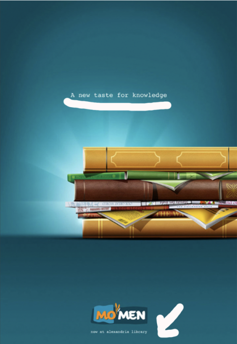
Proximity analysis
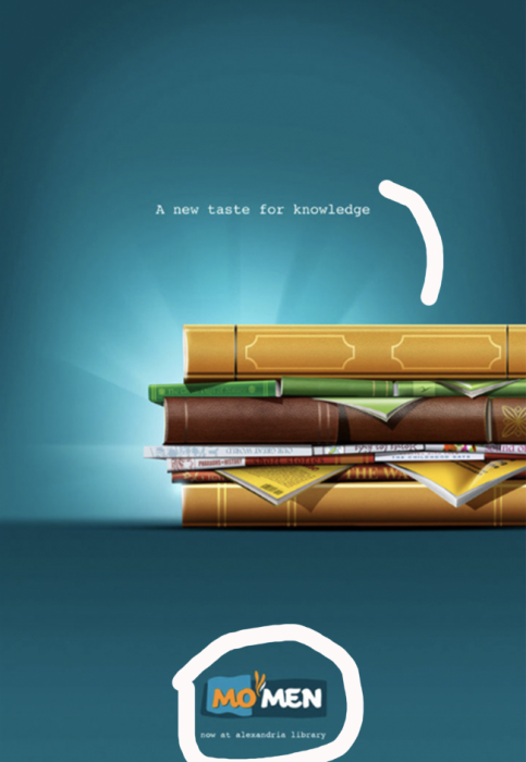
It is clear that the text “a new taste for knowledge” is closer to the hamburger than is the rest of the text at the bottom, which is more informational. The text at the bottom of the ad is informational in nature and includes the logo of the restaurant as well as the location of their newest opening.
Color analysis
The colors used in this design are strong and indicative of the shapes and objects being represented in the design.
In conclusion, Ahmed El-Habashy nailed the design for Mo’men’s new restaurant at the library. The clever mix of food and books is spot on. The contrast, alignment, repetition, proximity, and colors used in the design grab your attention and tell a unique story. The hamburger made of magazines? Brilliant. Everything aligns seamlessly, from the catchphrase to the restaurant’s logo. It’s not just an ad; it’s a visual feast that perfectly blends culinary and literary vibes.