Introduction
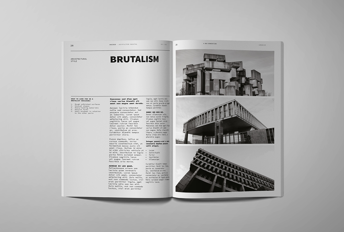
This magazine layout belongs to an architecture magazine. I discovered the design here, but there’s no mention of the layout designer or the photographer. The magazine showcases building photos alongside text, focusing on brutalism in architecture.
Analysis
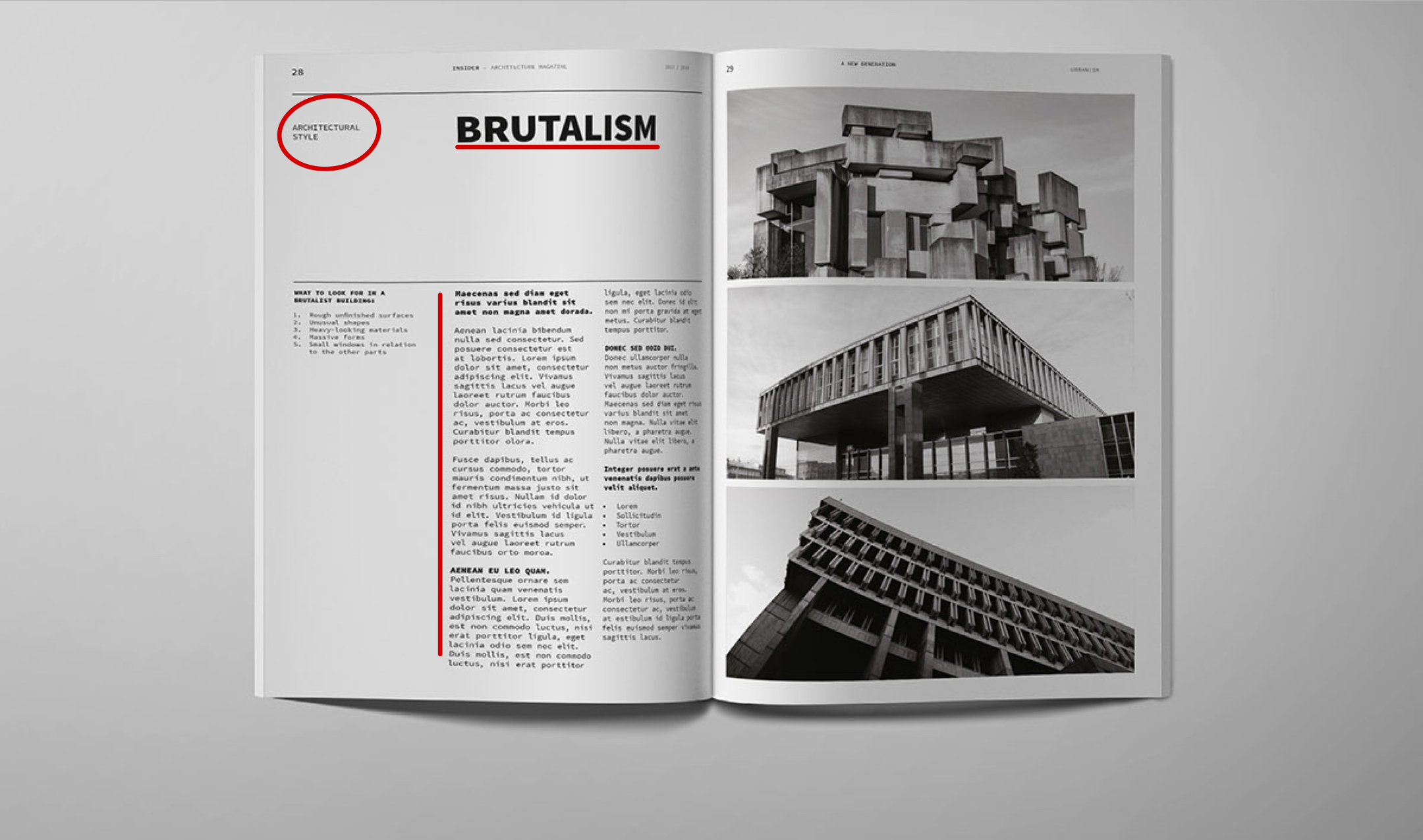
The title stands out with a bold sans serif font at the top of the page, commanding attention. Throughout the rest of the article, a smaller oldstyle font is used, offering a subtle contrast with its serifs and smaller size.
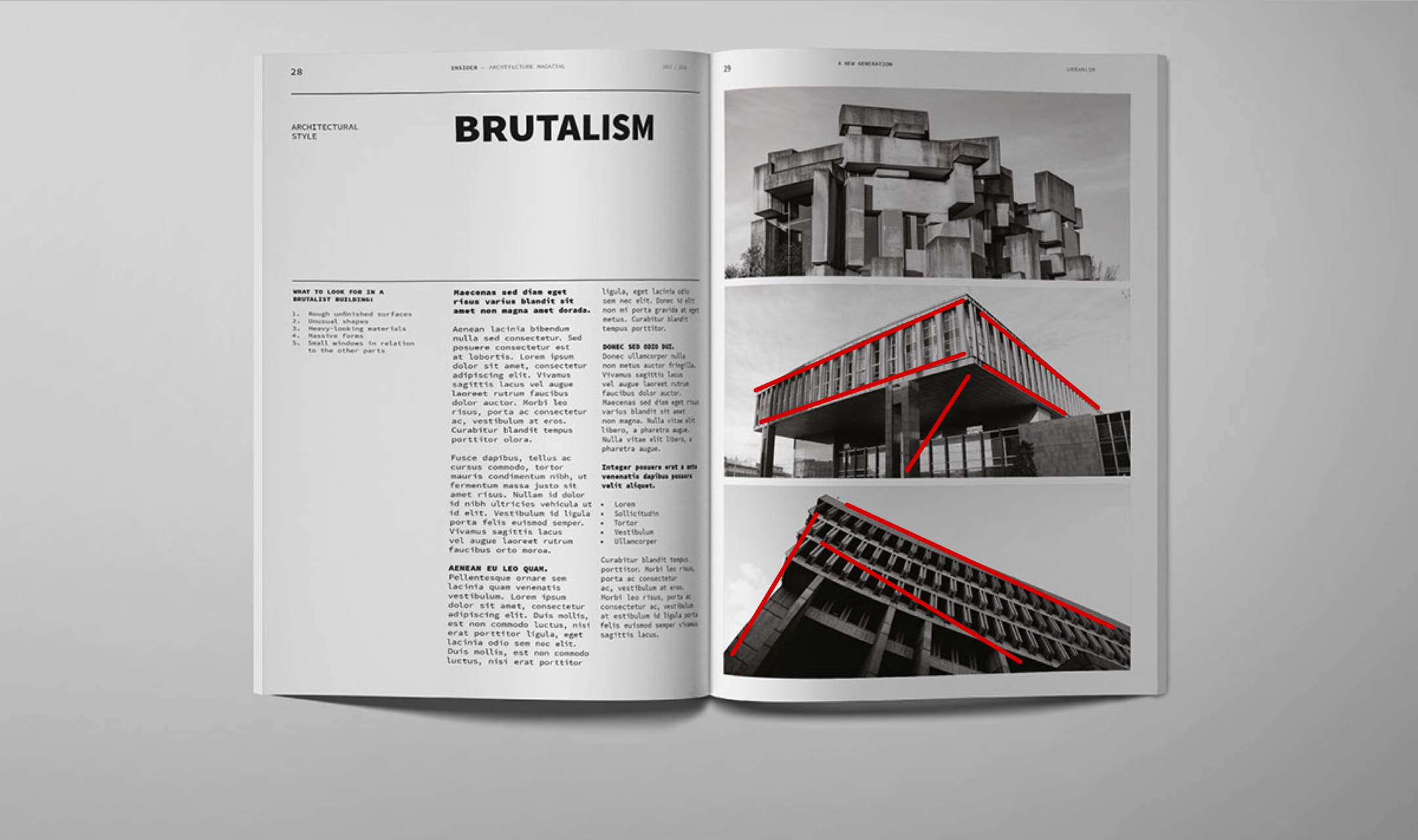
The photographer skillfully employed leading lines in the side photographs. The chosen perspective of the buildings accentuates their square features, guiding our eyes toward the focal point of each image.
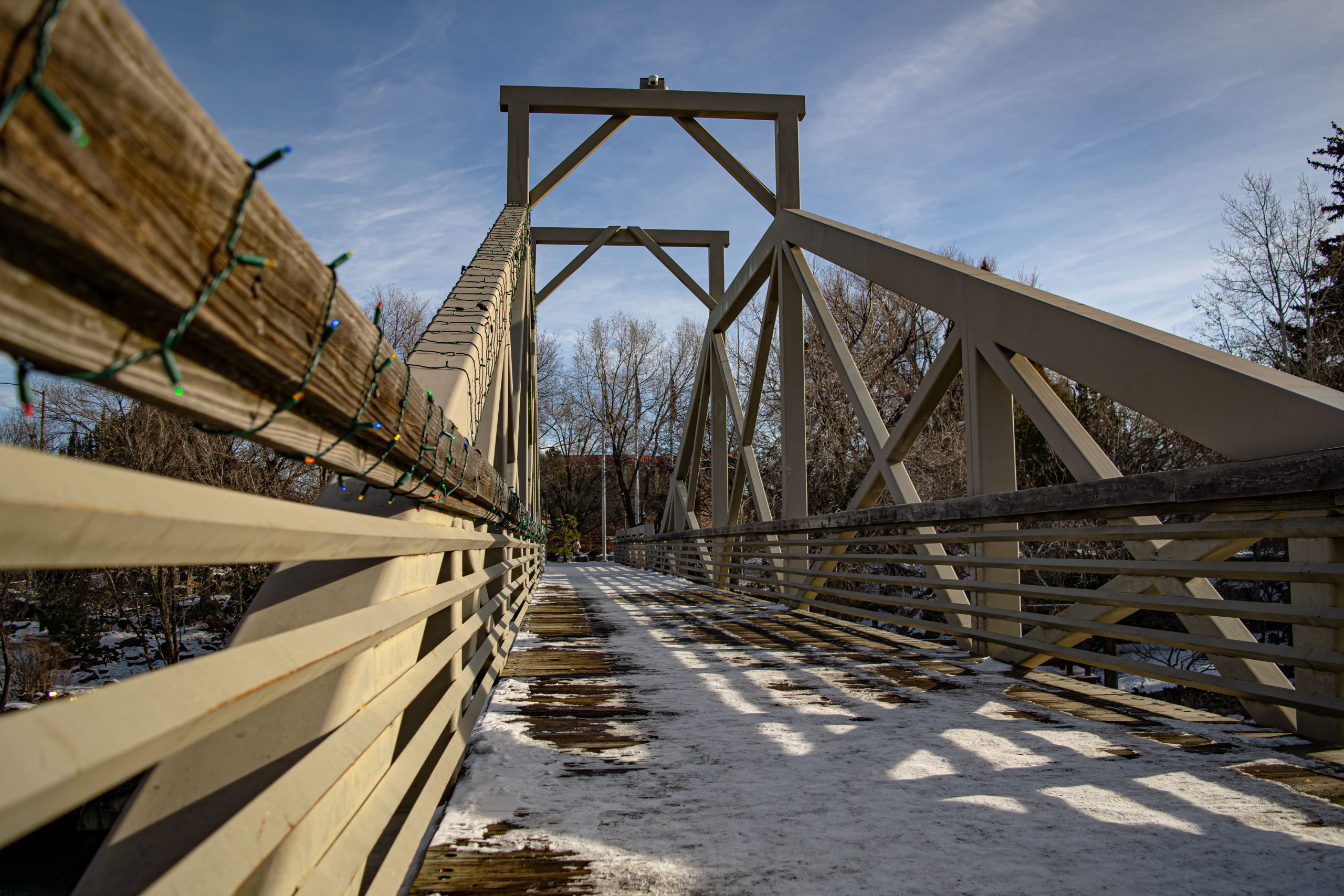
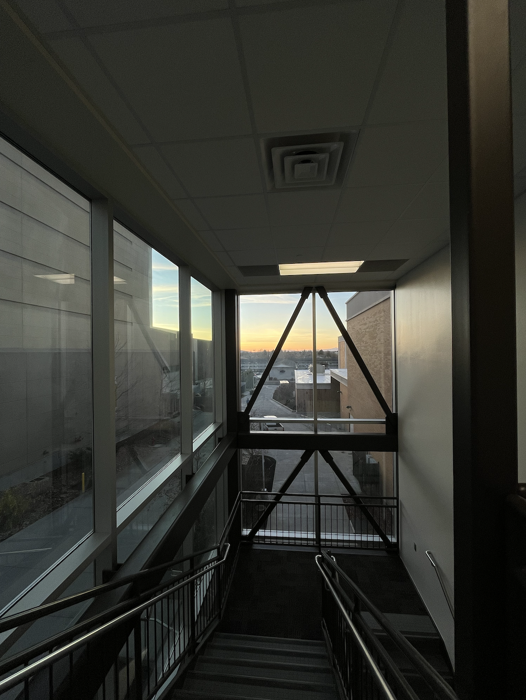
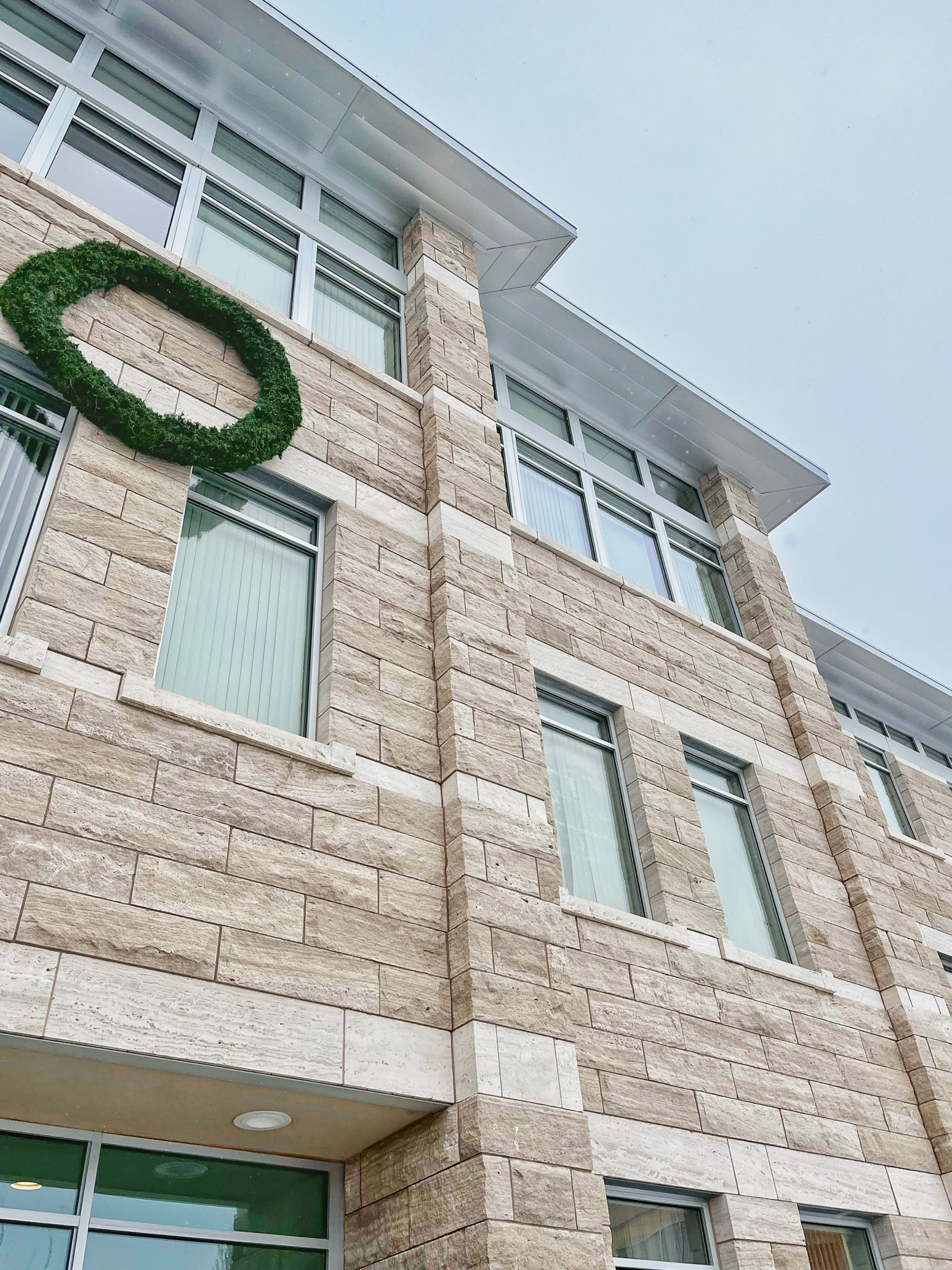
I tried to mimic the style of the magazine’s photos by playing around with leading lines, both indoors and outdoors. My goal was to capture the same depth and visual appeal seen in the magazine’s images. By experimenting with various angles and perspectives, I hoped to convey the architectural essence portrayed in the magazine.
Conclusion
In conclusion, exploring the layout, fonts, and photography of the architecture magazine provided valuable insights into design principles and techniques. Through analyzing leading lines, font choices, and composition, I gained a deeper appreciation for the artistry and impact of architectural communication. These experiences have not only enhanced my understanding of design but also inspired me to continue exploring and honing my own creative skills in the future.
